Part Six: Sound Effects
Sound effects are your friend. Nothing depresses me more than seeing feeble little effects tucked away in the corners of artwork. Treat every sound effect in a script like a Christmas present from the writer!
I'm not one for apologetic sound effects -- I like 'em big and bold, but if you're doing paying work you should probably check with your editor to see how they feel first. At the end of the day, they may not always be appropriate, so check the tone before you go too crazy!
The first thing you need -- obviously -- is a good, all purpose SFX font. In each job, I try to have a default font that I use for all 'standard' FX, to maintain a certain amount of consistency. It's not uncommon to see FX-heavy pages where there are half a dozen or more fonts. I think that would be bad design anywhere else, and I think it's bad design here.
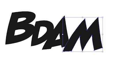
Consequently, I have one font that I use by default for all normal FX in a particular job -- all your KABOOM, BDAM and AAARGHs -- a sharper or harder font for harsher sounds, and a softer one for, you guessed, softer FX. For example, for a particular strip I might try to restrict myself to the following …
I've spent a lot of money on fonts I thought would make a good 'standard' FX font, but ironically Blambot's free Badaboom is as probably good as any to start with!
I have discovered very recently that Tom Orzechowski draws rough SFX onto the artwork with the pencil tool to make sure he gets an attractive arrangement of letters that fits the space available, and then makes a font effect to fit the rough. This is brilliant and I wish I'd thought of it! Going forward, I’ll certainly be trying this.
To take one effect as an example, here are some (hopefully) useful tips on SFX creation.
Normal SFX
There are two basic approaches to creating a sound effect.
Either way, you're going to need to type or paste your basic text.
You can then either use the typographic controls - point size, tracking and baseline shift - to work on the editable text to make the letters look more like a sound effect:
When you're happy with the result, go to the Type Menu and Create Outlines:
Alternatively, you can type your text and go straight to Create Outlines. Either way, the next thing you need to do is go to the Object Menu and select Ungroup:
If you haven't already formatted the text, you can now manipulate the individual letters as shapes using the Selection tool:
Either way, you will end up with a SFX that you like the look of. At this point, our old friend Pathfinder -> Add Shape to Area makes another appearance:
If you apply a stroke and fill, you will probably find that the results are not pleasing, particularly if you want to apply a heavy stroke:
There is a very quick fix to this. Go to the Appearance palette:
And drag the Fill so that it appears above the stroke:
The result will be much more pleasing to the eye!
It’s very important to remember that this technique is really only good for two or three points worth of stroke weight at most. If you find yourself in need of a heavier outline, then you need to use Path -> Offset Path to create a larger version of the SFX and fill the outer shape with black or the colour of your choice.
Note that if you don't want the letters to appear as part of one shape, but as separate letters:
Then simply don't use the Pathfinder function, but Group the shapes instead.
SFX can quickly be spruced up with a Gradient Fill:
Don't forget that you can change the angle of the Fill:
You can spiff it up still further by adding an inline:
This is also fairly easy:
With your sound effect selected and the Selection tool (V) active, Copy (CMD-C), then Paste In Front (CMD-F)
Initially, you won't be able to see anything, because you've created an exact copy on top of the original.
Change the Fill to 'None' and the result will not be attractive:
However, if you change the Stroke colour to something that compliments the Fill, and reduce the stroke weight to something significantly lower than the original ...
... Then you should get the desired result:
SFX on a Path
Longer SFX can be quickly livened up by running the text along a path.
Draw a curved path the fits on the artwork with the Pen tool:
Select the Type on Path tool:
Click on the path and type or paste the SFX:
Liven it up a bit by closing up the spacing with the tracking, and changing the point size and/or baseline shift values of individual characters:
Once you're happy, you can change to Outlines and tart up however you wish:
Outline/Hollow SFX
Hollow SFX are relatively straightforward, but are very useful when space is tight, since they do not completely obscure the artwork beneath.
At their most basic, you can just create the SFX, turn to outlines, and give it a Stroke but no Fill:
However, this is not always very readable. Expand the Pathfinder group so that it is one path:
Then select 'Outline Stroke' from the Path menu:
This will turn the stroke -- at whatever value you have it set to -- into a filled shape:
 |
You can then apply a Stroke to this new shape:
 |
Again, remember that if you want more than a couple of points of stroke weight, you need to fall back on Offset Path in order to get reliable results.
Masked or Clipped SFX
IMPORTANT NOTE: If you are working on low-resolution or positional artwork, this technique may not be appropriate since low resolution files are not generally detailed enough to draw an accurate mask. If your publisher marries up your lettering files with high-res artwork in the production stage, then they may actively discourage the use of clipping masks, since they require pinpoint precision matching up with artwork and complicate the production process substantially. If you are outputting the final artwork files, then you should be fine, otherwise: check with your editor!
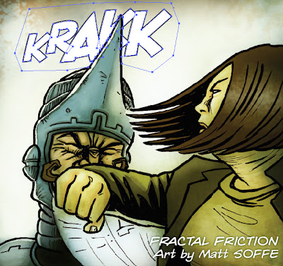
Another very effective way of using SFX in limited space is to mask them, so that they appear to be ‘behind’ certain elements of the artwork, like this:
Another very effective way of using SFX in limited space is to mask them, so that they appear to be ‘behind’ certain elements of the artwork, like this:
 |
| Art by Matt Soffe |
Create your sound effect as normal on the SFX layer and position where you want it:
 |
Using the Pen tool, carefully draw a shape around the SFX. Only the parts of the SFX that are inside the shape you draw will be visible once the masking option is complete.
 |
 |
When you’ve finished, change your SFX back to 100% opacity, make sure your Clipping path is on top of the SFX (use CMD-SHIFT-] to bring it to the front if you’re unsure) and then use the Selection tool to select both elements:
 |
The use Object -> Clipping Mask -> Make (or CMD-7):
And the SFX should now be masked, to show the elements of the artwork that you want to remain visible.
You can make quite complex clipping masks using the Pathfinder operation to combine multiple paths into one mask. In this rather tasty panel from the upcoming Strip magazine:
 |
| Art by PJ Holden |
You can see that the masking operation is quite complex (you may have to click through to the larger version of that image). In fact, there are three separate elements to the Clipping Mask:
Elements 1 and 2 make up the basic shape, through which the SFX will be visible. These are drawn separately and then turned into a single shape using Add Shape to Area (Make Compound Path also works). However, I realized that I also wanted some of the shrapnel to be visible, so I drew round three bits of shrapnel in Element 3 separately, merged them with Add Shape, and then used Subtract Shape from Area to remove from the combined shape of Elements 1 and 2, effectively making a ‘hole’ in the mask through which the image beneath can show.
Soft Drop Shadows
One word about soft drop shadows.
Don’t.
No, seriously, just don’t. In terms of something like magazine design, a drop shadow can work to lift a design element clear of a page which, by definition, is supposed to be a flat plane.
A comic page is a series of flat images drawn in such a way as to convince the reader that these are people and objects in three-dimensional space. Using a soft drop shadow casts the shadow on a single plane, effectively calling the reader’s attention to the two-dimensional surface of the paper itself. It does not respect the relative distances bewteen the objects in the panel that the artist is trying to convey. At a stroke, a soft drop shadow instantly sucks any illusion of depth that the artist has created from the page and renders it a collection of flat lines.
Here, I've ruined a couple of panels of Chris Askham's lovely Fractal Friction art in precisely the manner I'm describing:
Additionally, the idea of a soft drop shadow doesn’t make any sense since the SFX aren’t tangible objects within the scene; they’re an abstract manifestation of something the medium cannot convey: sound. The idea, then, that they exist as physical objects within the scene, able to capture light and cast shadows is -- excepting the deliberate breaking of the fourth wall -- a complete nonsense.
Don’t do it!


This is simply the greatest blog ever written.
ReplyDeleteThat's very kind of you. It's not true, but it's very kind! I intend to have that engraved on my headstone.
ReplyDeleteexcellent, jim. possibly you should write a book.
ReplyDeleteGreat post. The Clipping Mask is how I always suspected this was done, but I wasn't sure of it since it seems letterers have to fly through pages. I was second-guessing whether or not you guys have the time to sit and fine-tune a mask like that.
ReplyDeleteJim,
ReplyDeleteThank you so much for this blog! I am going to delve into the world of comic book lettering, and I know this blog will help me greatly!
Thank you so much.
Very good examples.
ReplyDeleteNice tips...I just have one last question- when doing lettering is it better to import the art into Illustrator? I've done lettering for a project(of mine) over some B&W templates, and then imported it into Photoshop to lay over the actual colored work. Also, would like to see more on using the gradients with lettering- I suck at it.
ReplyDeleteHi, Anonymous! If you have access to the final colour art, I would always place it on the Illustrator lettering document and then export the final files from Illustrator. Bringing the lettering back into Photoshop is just adding an extra step to your process and potentially messing up settings for how your black is composed and which elements overprint…
ReplyDelete+1 for Jim answering questions on a five year old blog post. Cheers Jim and thanks for the great posts!
ReplyDeleteYou prob havent had a visitor in awhile - but this is SOO useful!
ReplyDelete