Monday 30 December 2019

Facts matter: an apology

Facts. They're important. Recently, talking on social media about a previous matter relating to Bleeding Cool and Rich Johnston specifically, I got something wrong and I owe Rich an apology.

To be clear: I don't like Bleeding Cool. I don't like what they do or the way they do it, but that isn't the issue here.

A few years back, I got a surprising amount of stick for criticising the wave of outrage directed at Jeremy Clarkson over his "striking public sector workers should be executed in front of their families" comment. People were aghast that I was "defending Jeremy Clarkson". Except that wasn't what I was doing. Clarkson's remark was the punchline to a perfectly good joke about the BBC's "balanced coverage" policy — my point, the principle I was defending, was that it is fundamentally wrong to strip words of their context and use them to claim someone said something that they patently didn't say. My point was that if we allowed such behaviour to go unchallenged then none of us is safe. 

If we allow someone to be misrepresented simply because we don't like them, or because the false statement or sentiment attributed to them aligns with our own feelings about them, then it stops being a principle and who will stand up for us when we're on the receiving end?

Which brings us to my apology. For the purposes of clarity, what I said (more or less) was that Bleeding Cool gave a platform to white supremacist Vox Day and that, when faced with a backlash, Rich Johnston was removed from his position and that this was obviously a transparent attempt at damage limitation because he was back in post a couple of days later as if nothing had happened.

To his credit, Rich sent me a perfectly civil email simply saying "That isn't true". So I googled the whole sorry affair.

And it isn't true. It was initially reported by some online sources that Rich had been removed, due (I think) to confusion between his role/job title at BC and that of Mark Seifert, author of the Vox Day interview.

I don't know now whether I missed the subsequent clarifications on this point, or whether my own inherent biases have cause me to remember the matter very selectively. 

It doesn't matter. I was wrong. People can (and have) argued at length about how much happens on BC without Rich's knowledge, and I think it's uncontroversial to say that the whole interview with Day was, at the very least, disastrously misjudged, but none of that matters, because facts matter and I made a specific accusation against a specific person based on incorrect information.

Truth and facts are under attack from all sides. There are people and organisations out there in the new and old media actively trying to undermine the very notion of objective 'fact' and they need to be resisted with every fibre of our being.

And that's the thing. Facts either matter, or they don't, and I believe that they do. We can't defend the notion of 'objective truth' if we only choose to defend it in instances that align with our own philosophical, moral or political positions. We have to be better than that. I have to be better than that.

Rich: I got this wrong. I'm sorry, and I wanted to set the record straight.

Saturday 26 October 2019

Desert Island Fonts


About a million years ago, artist PJ Holden (who's actually a very handy letterer himself) tweeted on the subject of lettering:

"Ok-you have six fonts you have to live with forever: what are they?"

And then rather presciently added… "(This is a good starting point for a blog post...)"

I dutifully started typing up a blog post on the subject and then, unsurprisingly, forgot all about it. When I decided to revive this blog, however, I remembered that half-written post and tracked it down.

So. If I was only allowed six fonts to try and make my way as a letterer…?

You can probably get away with just one all-purpose dialogue font to do the heavy lifting… one that's 'neutral' in tone (something 'bouncy' feels specific to stories that are lighter in tone, something heavier or spikier is likely more suitable for darker or more serious projects, so you'd need to steer a course between the two).

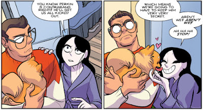
I'd almost certainly plump for Blambot's Heavy Mettle BB, mainly because you get an all upper and a mixed-case version, plus an Extra Bold weight. I've used it on a wide variety of projects (from Giant Days for BOOM to SIX for 451) and it's never looked out of place. The letterforms themselves also put me in mind of John Workman's always-amazing lettering, which is never a bad thing.

Giant Days #47: Words by John Allison, art by Max Sarin, colours by Whitney Colgar

SIX #1: Words by Andi Ewington, art by Mack Chater, colours by Dee Cunniffe

Weavers #1: Words by Si Spurrier, art by Dylan Burnett, colours by Triona Farrell


You'll need at least one ‘handwriting’ font for the inevitable diary/ journal/ letters. Handwriting fonts are the bane of my life — I must have spent hundreds of pounds on dozens of fonts and the inescapable truth is that fonts that actually look like handwriting are never legible for large blocks of text, and ones that are legible never look much like handwriting. Given the choice between these two options, I always opt for legibility and assume that the reader will be able to infer that the text is meant to be 'hand-written' from context.

My default choice is almost always Comicraft's CCDearDiary. (Honourable mention for Blambot's Chewed Pen BB, which has the benefit of being free for amateur/small press/indie letterers.)


You need one ‘clean’ sound effect font to do the bulk of the SFX lettering. I'm not a fan of using dozens of different fonts for SFX on any given project, so this would be no major hardship for me.

I'd probably settle for Blambot's Fight To The Finish BB. It's not my absolute favourite, but comes with multiple weights/styles and is neither too jaunty for 'serious' books nor too weighty for lighter ones.


Add in one rough/brush SFX font for variety. I'd go with Blambot's Beelzebrush BB — it comes in regular and black weights, with alternate font versions for both weights, so you can get six non-repeating ‘O’s in that BOOOOOOM by using the uppercase ‘O’, the lowercase ‘o’ and then zero, and then repeating with the alternate version of the font.


Two left…? A couple of general purpose design/titling/signage fonts, maybe? Comicraft's CCHipflask and CCEnemyLines.


The obvious omission here is any kind of special/creature dialogue fonts. I'm not averse to using those, but (like a lot of letterers lately) I'm trying to push back on their over-use. In all honesty, you can probably distinguish that robot/vampire/whatever dialogue with some creative balloon and colour choices, so I haven't chosen any.

And just to tidy that all up:

Heavy Mettle BB:
CCDearDiary:
Beelzebrush BB:
CCHipflask:
CCEnemyLines:

Monday 21 October 2019

Quick Workflow Hints #1

I really need to stop neglecting this blog. I apologise – I've been lured away by the siren call of other social media and my brain has been mildly broken by three years of unending Brexit madness. Let's try and get some content back on here on at least a semi-regular basis!

So… in that spirit, I'll try to get the ball rolling with some shorter posts about simple things that might help your workflow. This will likely often be Mac-specific, so further apologies to users of other platforms, but Macs are what I know…!

Quick Workflow Hint #1

Here's a handy Mac Finder hint… you all know about CMD-ALT-I…? Forgive me if you already do, but it's incredibly useful if you don't.
Where CMD-I in the Finder gives you an info window on your selected item, CMD-ALT-I does two things. On multiple selections, it shows you all the commonly shared info on those files (so if they're not all, say, grayscale, it won't tell you the colour space) and the combined disk space they take up. If you want to change the default application to open all the JPEGs (or whatever) in a single folder but leave the general setting for the default unchanged, you can do it here.
On a single file selection, it gives you a persistent floating 'inspector' window, so you can use the down-arrow key to work down a list of (say) TIFFs and the info window will update for each new file as it's highlighted, so you can check that all the TIFFs are the same size (it will only give you pixel dimensions, but you can immediately see if some of the files are a different size), that they're all CMYK, even that they all have the same colour profile.
Not earth-shattering, I know, but this regularly saves me a couple of minutes and those minutes all add up over repetitious tasks.