Wednesday 6 May 2020

Workflow Hints #2

Just another quick timesaver.

Has some kind soul sent you a bunch of artwork files that are on-spec but have annoyingly huge file sizes because they've saved the TIFFs without LZW compression?

(Artists and colourists! Seriously, stop doing this. LZW compression is lossless, meaning that there is zero effect on quality. What it does dramatically effect is the file size:


You'll save both disk space and upload/download time for everyone in your entire creative process if you just check that little LZW compression radio button!)

Obviously, you could just set up an Action and batch process the files, but Photoshop saves you the trouble by providing a ready-built option.

If you look under File -> Scripts you'll find an option called "Image Processor" which, if you set it up like this…


…will handle it for you. It also seems to be much, much faster than running a batch process using Actions.

Monday 10 February 2020

Zound Effects And More!

(aka Lettering the Zaucer of Zilk)


Very shortly after 2019's excellent Thought Bubble convention, I received The Call from none other than Tharg the Mighty who, as I'm sure you know, is the alien editor of 2000AD, the Galaxy's Greatest Comic. More accurately, he tasked his human assistant, Matt Smith (longest-serving holder of this thankless role) to invite me to join the lettering team on 2000AD.

Under normal circumstances, this would have been a cause for much rejoicing — I've been a reader and fan of 2000AD since 1979 and have had the pleasure of doing some non-2000AD work for publishers, Rebellion. However, this came as a result of the sad news that one of the regular team, Ellie de Ville was seriously ill. Tragically, Ellie died a few weeks later. Although I never met her, her work has been a constant through 2000AD and many other UK comics of yesteryear for decades and her untimely passing was a sad loss and, I'm sure, a terrible blow to her family and many friends. You can read a short selection of tributes here.

That made my addition to the lettering roster the first change in 2000AD's line-up of letterers since the death of Tom Frame, back in 2006, which is certainly a testament to both the loyalty felt towards the comic, and extended back to its contributors.

All of which made picking up that baton a strange and sad thing. Over in the Judge Dredd Megazine, I was asked to take over lettering a fan-favourite strip, the entirely brilliant 'Lawless' by Dan Abnett and Phil Winslade. Given that these episodes are likely to end up in a collected edition at some point, alongside pages that Ellie lettered, I could do no more than find a lettering style that would jar as little as possible for the transition.


Lawless © 2000AD/Rebellion Script by Dan Abnett/Art Phil Winslade
There are already two collected editions of the series, which I would urge you to check out: Volume One and Volume Two. If you like a science fiction Western (and who doesn't?) this is going to be right up your street.

Meanwhile, I was also asked to letter two strips for 2000AD's bumper end-of-year edition for 2019. One was a (sort of festive!) one-off Durham Red story by Alec Worley and Ben Wilsher.


Durham Red © 2000AD/Rebellion Script Alec Worley/Art Ben Wilsher
The other was a new series, a sequel to 2012's Zaucer of Zilk by Al Ewing and Brendan McCarthy, continuing with Peter (Resident Alien) Hogan taking over co-writing duties and Len O'Grady sharing colouring.

Brendan is possibly best known outside UK comics for the career he took up in the late 80s and early 90s as a designer and storyboarder for film and TV, and perhaps most famously as co-writer of Mad Max: Fury Road.

UK comic fans of a certain age will be familiar with his work going back to the early days of 2000AD where his bold, graphic style and phenomenal use of colour warped many a fragile little mind.


Judge Dredd © 2000AD/Rebellion Script John Wagner & Alan Grant/Art Brendan McCarthy & Riot /Lettering Tom Frame


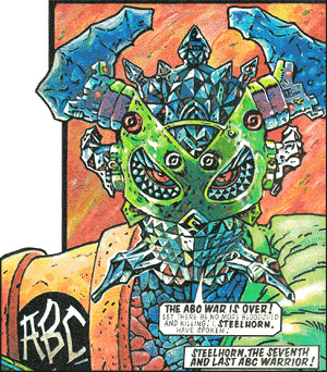
ABC Warriors © 2000AD/Rebellion Script Pat Mills/Art Brendan McCarthy/Lettering Pete Knight
Even though 2000AD has never had a 'house style' and is always home to an amazing range of artists' styles, it was fairly obvious from the outset that the new series of Zaucer wasn't going to look like anything else in the prog, and with a series that I can only really describe as the bastard offspring of Dr Strange and Yellow Submarine, wasn't going to read like anything else either… so I decided that maybe the lettering ought to catch a little of that whimsy, too.

I quickly settled on Comicraft's CCMoritat for the dialogue — it has lots of character, is still legible and, if you run it with the horizontal scale up a touch, it reminds me a lot of the wonderful Steve Parkhouse's hand-lettering…


The Bojeffries Sage © Alan Moore & Steve Parkhouse Script Alan Moore/Art & Lettering Steve Parkhouse

Using balloon shapes drawn 'by hand' (albeit digitally) that referenced the many years of classic hand-lettering for 2000AD, I came up with a lettering style that I hoped hit the mark…


Zaucer of Zilk II © 2000AD/Rebellion Script Peter Hogan & Brendan McCarthy/Art Brendan McCarthy/Colours Brendan McCarthy & Len O'Grady
Matt Smith showed my sample page to the Mighty One, and, to my relief, he liked it. In fact, he even commented that the style reminded him of Steve Parkhouse's hand-lettering… so that was job done!

And I'm having a great time working on the series. Peter has kindly brought back the desperately unfashionable thought balloon, which is a device I've missed terribly and rarely get to letter outside Garfield books:


I've enjoyed trying to integrate the lettering into the art where I can, rather than just letting all the lettering float on top of the art… even if it's just a little overlap, as with the first panel below, where the Tailor's hat and a tiny bird overlap the caption.


I also know that Brendan has said in the past that he's not much enamoured of digital lettering, which was another reason I wanted to bring a little extra character to the strip's lettering. Plus, y'know, Brendan's a mad genius.

Sadly, almost no publisher will sign off on hand-lettering dialogue these days — it's slow (and more expensive than digital because a letterer needs to charge extra to reflect the additional time spent on the pages) and makes doing both corrections and repurposing lettering for translated editions much more difficult.

However, there are relatively few sound effects in Zaucer, so I thought I might be able to spend a bit of extra time on those, and draw them by hand — creating them in Photoshop on new layers over the artwork for reference using a Cintiq, and then bringing them into Illustrator and converting them to vectors.

(I'll confess that Photoshop isn't my first choice for drawing anything, but the workflow is easy — simply collapse any layers with elements you want to bring into Illustrator, draw a selection marquee over the sound effect and you can just drag and drop from Photoshop onto your Illustrator page. Once there, Illustrator's Image Trace will vectorise the effect in moments.)


With a little bit of care, it's even possible to try and combine them into the art. I've seen plenty of Brendan's hand-drawn sound effects, and I wouldn't try to pretend that mine look half as good, but I was quite pleased with the way this one, in particular, combined with Brendan and Len's lovely work.


And that's it. A quick look behind the curtain(down)…I hope you're having as much fun reading the strip as I'm having working on it.

Thursday 30 January 2020

Affinity Designer: Alternatives to Adobe Illustrator for Lettering


Anyone who follows me on social media will know that I fairly regularly point people to Serif's Affinity suite (Designer, Photo, Publisher) as a viable alternative to the design/print portion of Adobe's Creative Cloud offering (Illustrator, Photoshop and InDesign respectively). The software is very reasonably priced, is a one-time purchase for a perpetual license rather than Adobe's subscription model, and is available for Mac, Windows and iOS (although only Designer and Photo at present).

I've been intermittently doing test pages lettering with Designer, usually whenever the application gets an update, but I'll confess that I haven't attempted to actually do a job using it, until now. For the record, I'm running the current Mac versions (1.7.3) of all the Affinity applications on Mojave (10.14) but I've seen no reports of issues running them on Catalina (10.15).

Designer certainly covers a letterer's requirements in all the big ways — you can set up colour-managed CMYK documents with bleeds, control important trapping settings like knockout/overprint, and export files successfully in all the commonly-used file formats (TIFF, EPS, PDF for print and JPEG or (God forbid) GIF for web comics). 

(As an aside, I've checked how these file exports fit into an Adobe-only print workflow of the kind a publisher is likely to be using. EPS files place in InDesign exactly as expected, and a lettering-only PDF file with transparency effects places over a separate artwork file in InDesign with all the transparencies rendered correctly.)

One thing you can't do is export a file that is fully editable in Illustrator — in theory, a PDF exported from Designer should be fully editable in Illustrator, but in practise, it isn't. The developers at Serif have had this flagged and report that this is down to how Illustrator is interpreting the PDF data, which is 100% standard-compliant. Short version: this is something Adobe would have to fix on the Illustrator side, and they have no reason to do so and I have no realistic expectation that they will.

So, if you have clients who want lettering delivering as live .ai files, Designer isn't going to work for you.

The typographic controls are also good. OpenType features are fully supported and all the fine-grain controls over tracking, kerning, leading, horizontal scale and the like are present and familiar.

The shape and pen tools will all also be very familiar to Illustrator users, so the creation of captions and speech balloons is pretty much as you'd expect and the ability to merge balloons and tails non-destructively (so you can edit tails separately to the main balloon within the merged shape) is very welcome.

Text can be outlined, manipulated, merged, stroked and filled, so sound effects are also taken care of.

But… it's important to remember that this is a product that hasn't yet reached v2 and doesn't have the massive resources of a company the size of Adobe behind it, so there are some notable omissions that might catch you out.

There is no direct shear/skew tool. You can achieve this by numeric input into the Transform panel (which is how I usually do it in Illustrator anyway) but you can't deploy a tool to do this by eye on your document.

There is also no free distort or perspective distortion option, nor any warp/distortion tools at all. I use these, Roughen along with specific distortion effects like Wave/Flag, all the time in Illustrator, so this is a fairly big negative.

There are workarounds — most of these options exist in Affinity Photo (and the Affinity Suite allows you to switch between applications to utilise specific features without actually leaving your current application) but this requires the text to be rasterised. If you don't mind mixing your vector and raster elements, then this is a perfectly workable solution.

If you're supplying finished files with lettering and art combined, then using Photo for these effects is a reasonable option, but if you're delivering EPS/PDF files of lettering only, then it's likely to border on a deal-breaker.

I should add that the existence of these features in Photo suggests that they should be implementable in Designer (the applications share a large amount of common code) and all of these features are on the developers' 'Road Map' for features to be added. My suspicion is that we may not see them until Designer hits v2.0, which will be the next upgrade that will be paid-for and which (to the best of my knowledge) does not have a release date.

There are other Illustrator features that have no equivalent in Designer that I would characterise as "would be nice to have but not a deal-breaker" but which other letterers may use more and whose absence they would feel more keenly. There's no equivalent of Illustrator's Image Trace, for example. 

Also missing are a Knife tool (for slicing up shapes after they're drawn) and a Blend tool (where you can map one shape onto another and the software draws a user-specified number of intermediate steps transforming, say, a triangle into a square).

There's also no way to apply a calligraphic brush stroke to a shape (like a balloon). I like this effect a lot and use it frequently, but I can live without it. You can apply a slight stroke weight variation, however, which is a decent approximation of the same effect. Again, other people's mileage may vary.

All of these are on the developers' road map, but there's no formal timescale for when any of them will actually appear.

So, in summary, yes, you probably can replicate an Illustrator-based lettering workflow using Designer, with some fairly significant caveats. Some of those caveats listed above may well be deal-breakers for many letterers, but everyone's workflow is so different and so personalised that it's impossible to say which ones might be problematic for a specific letterer.

Nonetheless, Designer is very, very near to being a direct replacement for Illustrator and I continue to watch its development closely. The iOS version is particularly exciting since it brings the very real possibility of being able letter comics on an iPad Pro, taking advantage of the best-in-class digital drawing capabilities of the Apple Pencil.

Further posts on this as and when updates to the software bring us closer to that goal of a feature-complete Illustrator replacement.