
In the absence of any formal submissions to my brilliant idea to hold surgery, I've picked up a couple of things…
Indiana Jones and the Template of Doom
Anonymous posts to the comments in Part Two of the lettering guide:
"Any chance you could post the save file for your single and double page templates?"
Short answer: No.
You don't want to be using my template, because you don't want to assume that my template is suitable for your job. In fact, you shouldn't even assume that your template is good for every job. Specs can vary from publisher to publisher and even for different jobs with the same publisher -- witness the 68 pages I had to manually re-size last week for precisely the reason that I stupidly assumed that a new job was the same page specification as the previous one.
Checking job specification doesn't make you look stupid, it means that you want to get it right and makes you look professional.
Antialias Smith & Jones
… And to pick an unfinished (on my part, at least) discussion from the 2000AD forums on the subject of preparing scanned linework for colouring.
There was some debate as to the relative merits of using Levels or Curves, possibly via Adjustment Layers, to clean up scanned linework against using the Threshold command or converting to Bitmap.
To be clear on this: if you're producing work for yourself, start to finish, then any method that works for you is perfectly valid. However, if you harbour ambitions to work professionally in the comic industry, you need to adapt your working methods to the needs of the production process.
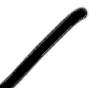
The issue seems to be a belief that a line has to be anti-aliased because in Bitmap mode, it looks jagged, and this is bad:

Make no mistake, you can use any technique you like to clean the linework up, drop out pencil smudges and eraser marks, darken up areas of uneven ink coverage, but when you've finished, your linework needs to look like the example above when you zoom in on it. It is most emphatically not bad.
There are a number of excellent reasons why lineart needs to be converted to absolute B&W for professional publication.
The very first thing a colourist will do is select all the linework on a page and save it as a channel, this is so that s/he can create a trapping layer underneath the black; protect the linework while painting; restore the linework in the event of an error; and accurately mask the artwork and paint inside the linework selection to make colour holds.
In order to do this, they need to be able to make a clean selection. If the artwork is not absolute black and white, they can't do this and the very edges of the lines get missed:
This is why -- with amateur colourists -- you will often see white or grey fringing at the edges of colour areas where they meet linework.
Now, you might say that having the linework layer over the colours and set to multiply will get round this if you colour underneath the lines, which it will. However, it won't help you make a clean selection for a colour hold, nor will it help you trap the linework. Even if you're colouring your own work (fairly rare in this day and age, but it still happens) then you should trap the linework in accordance with the publisher's production guidelines…
Put simply, trapping the linework involves making a near-copy of the linework that will appear on the CM and Y plates, to ensure that you don't get a white halo around the linework if the plates are misaligned on the press. To trap the linework, you load the linework selection, create a new layer called Trap directly beneath the linework, Contract the selection by 1 or 2px and fill with the production dept's specified trap colour (usually something like C60M60Y40). The linework itself sits on top of this layer and is set to Multiply.
For all these reasons, if your work goes to a professional colourist, the first thing they will do is use the Threshold command to drop out the fuzzy edges of the linework. Yes, you can absolutely use Levels, Curves or whatever for finer control to determine what's black and what's white, but you need to then have those hard edges on the linework.
It's the same reason why Manga Studio only draws in B&W with no soft edges. Photoshop has conditioned people to think that everything has to be antialiased but just because you can see jagged edges on the linework when you're zoomed in to 600% doesn't mean that you'll see them in print…
Cheers Jim- this is a great in depth explanation of some of the process. You've convinced me to use the Threshold function.
ReplyDeleteNo worries, Bruce! Like I say -- you can do all the stuff that Radiator was talking about. A lot of it IS good advice, but you need to add that final step to harden up the edges of the line work.
ReplyDeleteA handy detour into colouring tips - most appreciated, Jim.
ReplyDeleteIf I may ask a question/make a suggestion: would you consider a dedicated surgery session on the lettering in the Twilight graphic novel doing the rounds? I think it's fair to say that the text wasn't the work of a professional letterer and is fair game for evaluation on a purely technical level given the profile of the property, the effective distribution of the book (a comic) to mainstream outlets, the fact that this will in many cases be the only comic some of its audience will ever read, and the tendency towards derision in most of the critiques I've seen that usually go for laughs at its expense rather than examining where it could have gone better.
I'd understand if you didn't want to feature copyright images on the blog, though, or to wade through the book in its entirety.
I'm loathe to reproduce copyrighted material, but I do have a piece in preparation about bad lettering in professional publications… :-)
ReplyDeleteI'm amused to note that over on the 2000AD forum Radiator is saying that I'm claiming "my position is right"… In fact, my position is WHAT IT IS.
ReplyDeleteSo… I'm not saying I'm right, I'm relating a fact of life, which means that Radiator's not saying I'm wrong he is, presumably, saying I'm a liar. Either that or he hasn't read what I posted.
Whether I think it's the BEST way to do it is immaterial, and I don't understand why he's saying "Let the colourist do this stupid threshold conversion." If he's so adamant that it's destructive to the linework, why would you surrender that process to someone else? Surely better to do it yourself and retain SOME control?
Seriously, Tom -- how many pages of professionally published comics have you produced final print files for? More than 1? More than 100? More than 1000? How many images have you scanned professionally? More than 1000? More than 10000? More than 50000?
I don't care about your background in photography, because I'm talking about print production, about which I clearly know more than you.
I'm involved in several production workflows that I don't think are the best way of doing things, but that's HOW THEY ARE. My advice was about delivering line art files that will fit seamlessly into a professional comic book workflow. You know, the sort of thing that helps tip the balance when editors are deciding whether to give you more work?
Very interesting indeed, I learnt some useful stuff - thanks Jim.
ReplyDelete