Showing posts with label Manga Studio. Show all posts

Sunday, 21 November 2010

Sunday Surgery: (Not Quite) New Year's Resolution

A couple of days ago, Kyle Jones raised some excellent -- chiefly Manga Studio related -- questions that I thought were worth a Surgery session. I should stress that I don't use MS professionally (yet) but am more of an enthusiastic amateur. As such, I would unreservedly recommend Doug Hills' excellent book Manga Studio for Dummies as, effectively, the missing manual for this package.


Nonetheless, much of what Kyle is asking breaks down to a matter of resolution, about which I do know something.


Counter-intuitively, I'd like to deal with Kyle's last question first, since the answer informs much everything else.


"in Photoshop on my computer it was very difficult to digitally draw and ink anything much bigger than 300 dpi, but since Manga Studio handles larger dpi projects much better (and can easily handle 1200 dpi without slowing down), is there any point of overkill (or is bigger always better)? If one's computer can breeze through the 1200 dpi setting in Manga Studio, is there any reason to go less? (assuming it will ultimately be colored in Photoshop at a lower dpi)?"


This actually hits on something very important. There is an extraordinary amount of rubbish talked about resolution, and Kyle is exactly right when he refers to higher resolution as "overkill". As computers have become faster and hard drive space has become cheaper, there has been an automatic assumption that more is better. The last time I worked on pre-press, I was routinely being sent graphics files from agencies that were 3600dpi and higher.


This is crazy.


There's a very good reason why scanners offer very high resolution options: if you intend to scan an image and then digitally adjust it or scale it, then it makes sense to scan it at actual size but at high resolution, since making adjustments through the preview on a scanner's software interface is so imprecise as to be useless. Better to bring it into Photoshop at high resolution, adjust, scale, make other fine-tuned alterations and then reduce the dpi to the setting you need.


For this reason, comic line art is generally scanned at 600dpi and is (I suspect) the reason why 600dpi is the default resolution for Manga Studio layers.


But, as Kyle notes, the first thing most colourists will do is drop the resolution to 300dpi.


So… what is the ideal resolution for your documents? 


The answer is defined by the quality of the printed product. All printed material that has any kind of variation in colour or tone is made up of dots of ink on paper. The fineness of those dots in printing terms is defined by the screen frequency, which is measured in lines per inch or lpi.


There is a very complicated formula to enable conversion from dpi to lpi in order to work out optimum resolution, but I worked in newspaper and magazine production for ten years, and the rule of thumb which always worked in my experience is that, for an image that is 100% of printed size, optimum dpi = 2x printed lpi.


Old style B&W newsprint was anything from 45-75lpi


Most magazines are 100-120lpi


Really glossy brochures, art books and some high-end magazines might be as high as 150-175lpi.


I would be astonished if there is any comic on the market printing at higher than 150lpi on internal pages, and 175lpi on the front cover, so anything higher 350dpi (call it 400 if you think the artwork might be need to be scaled up at some point) at actual size is nothing more than a waste of hard drive space and CPU clock cycles. 


In almost all instances where the printed product will be colour or grayscale, 300dpi will be more than sufficient. If in serious doubt, find out what the lpi of the printed pages will be, but I'm prepared to bet cold, hard cash on the upper limit being 150lpi.


If you're creating aliased linework (with hard edges, of the kind that Manga Studio produces, for reasons explained in my previous post here) then you should do that at 600dpi -- if you were submitting traditional pen-and-ink work, that's what you'd be expected to scan it at, so it's as well to respect that as a convention. It's also important to note that the lpi to dpi conversion is only applicable to colour and grayscale documents. Absolute black and white is imaged in much more detail and 300dpi is insufficient in these circumstances.


(The two paragraphs above have been revised in line with some sage and timely advice from Mr Todd Klein, for whose input I am most grateful.) 


 "The brushes I had made in Photoshop were modeled after Freddie Williams' suggestions in his book "Digitally Drawing Comics". For instance, he suggested working in a 300 dpi project 11 x 17 inches and doing contour lines at 6 or 8 pixels as a starting point."


I will confess to being mystified as to why anyone would advise creating digital art from scratch on an oversized document -- the only difference it makes is to the Zoom percentages you have to use. In the layout, "pencilling" and "inking" stages, certainly in Manga Studio, I'd work at 600dpi and actual, printed size.


"What would be the millimeters of an 8 pixel or 3 pixel Photoshop brush in Manga Studio (if page size and resolution affects the brushes at all - which touches upon my next questions - then please assume the page size and dpi would be the same in both programs)?"


The resolution absolutely affects this. Pixels are the "d" (dots) in dpi, so the higher the dpi, the more tightly packed the dots and thus the smaller the pixels. Double the resolution and a brush measured in pixels shrinks to a quarter the size:


For reference, that 24px brush at 300dpi measures 2mm across, and 1mm across at 600dpi.


Manga Studio advises a very old-school way of determining "actual print size" on your monitor, which is to create a document and then adjust the zoom percentage on screen until the ruler at the top of the document matches an actual ruler that you hold against the screen. Once you've determined the zoom percentage that matches the real print dimensions, you can set this as the default value the application preferences and zoom to it with CMD-SHIFT-0 (zero):


Note that, dependent upon your own screen size and default resolution, the print size zoom percentage on your monitor is unlikely to be 16.4% -- you need to measure it yourself!


Manga Studio is much better at maintaining live updates of the same document in multiple windows than Photoshop, so it's worth creating two windows for your working document, one that you leave at Actual Print Size and the other that you do all the zooming in and out of, that way you can always quickly refer to how your linework will look on the finished page and ensure that your lines aren't becoming over-fiddly or insanely detailed. If you have a Cintiq or a dual monitor set up, you can keep the print size window for reference on the monitor that you don't use for the main drawing.


(This last hint shamelessly stolen wholesale from Mr Dave Gibbons' Manga Studio 'webinar' which you can see here, and which is well worth 90 minutes of your time.)


Because Manga Studio uses millimetres rather than pixels, MS brushes are the same size regardless of document resolution: 2mm is 2mm, resolution only changes how many pixels are squeezed into those 2mm.


I would genuinely advise trying to let go of the actual measurements of your pens and brushes, and simply worry about whether you're happy with the stroke weights they give at Actual Print Size.


Obviously, if you change the size of your document, then this will affect the size of your brushes and thus your strokes, which is why I recommend working at high resolution and actual size, rather than on an oversize document at lower resolution.


However, if you are determined to work on documents that are larger than printed size, the key thing to remember is that you are dealing with areas and not lengths. If you take a normal comic page and double the side lengths, you have increased the area by a factor of four.


Consequently, if you want to create a document that is twice the final, printed size of a comic page, you need to multiply the side lengths by the square root of two which, as near as makes no difference, is 1.4


Thus, if a comic page (including bleed) is 178mm x 269mm (sorry, US readers, the rest of the world is metric!) and you want to work on a page that is double that, you need to multiply each side by 1.4, to give 249mm x 377mm.


The same is true for brushes -- a 48px brush at actual size would need to be 48x1.4= 67px on a document scaled to two-up.


It's important to stress, though, that the whole point of artists working on oversize pages was originally to enable the artist to create finer strokes than they would be able to if they worked at actual size. The only reason for drawing at half or two up was so that the linework would appear finer when camera-ed down to actual size (and a certain amount of unevenness of line would also be eliminated). If you're going to scale up your brushes, you might as well not bother!


And that -- I think -- pretty much covers it. If any of this is unclear, or raises additional questions, then please use the Comments section to leave feedback and we'll come back to this in a future surgery session.


Cheers!


Jim

Sunday, 24 October 2010

Sunday Surgery

(I hope to feature twice-weekly 'surgeries' on this blog, on Wednesdays and Sundays. Feel free to request clarification on anything in this post via the Comments section, and to post questions that I'll do my best to answer at the next surgery on Wednesday.)

Love us TIFFs


To expand slightly on a hint which some of you may have missed, since it was tucked away in the Comments section…


Whilst larger publishers will usually ask for EPS or PDF files of the lettering only, preferring their own production departments to marry up high resolution artwork and lettering, for smaller publishers, small press and the like, you're likely to end up exporting finished page files from Illustrator, merging both the artwork and lettering into a TIFF file if the destination is print.


(Technically, this is pre-press and not lettering and there is a very good argument for this being a separately billable service over and above the lettering rate. This post, however, is not the place for that argument.)


The publisher will be able to tell you their preferred settings for this TIFF export: never, ever assume; always ask. Once you know what they are, you can save the export process as an action, which you can then run as a batch operation on the folder where your lettered pages are kept.


(This alone is good enough reason to maintain a logical filing system where your lettering files for each project are organized by individual issue.)


However, AI's LZW TIFFs are unnecessarily large. This can only be down to bad implementation of the algorithm by the Illustrator team Adobe. It cannot simply be unnecessary metadata, because there's too much of it, but the fact remains that you can reduce the files size by 30-50% simply by opening the TIFF in Photoshop, and forcing it to do something non-destructive but that will make Photoshop re-write the data.

Try opening an AI TIFF in Photoshop, double clicking the background layer to make it Layer 0, then Flatten Image and hit Save. It's worth saving this as an action and then using it to Batch process the folder of AI TIFFs that you've exported from Illustrator. Whilst this step does add time to your production process, it more than repays the investment with the reduction in FTP time -- it's not uncommon to see a 14Mb TIFF from Illustrator drop to 9 or 10Mb after the forced-save from Photoshop. Clearly, if you're FTPing an issue of twenty-odd pages then you may save upwards of 100Mb overall, which can buy you several precious minutes of upload time!


(This tip has been checked in CS3 and CS5, so I imagine it's good for CS4, too. I don't have ready access to CS on Windows, so if anyone wants to check for me and report back, I'd appreciate it!)


South of the (Panel) Border

In a shameless bit of recycling, I thought I'd re-present my quick tutorial on how to use the Panel Ruler feature in Manga Studio. Like many elements of Manga Studio, it's a huge time-saver, but the way it works is not immediately obvious.


(Credit is due to artist PJ Holden, whose original explanation I have merely expanded upon. Everything described below refers to Manga Studio v4 and works in both the Debut and EX versions.)


Start with a New Document:

(Dogbreath is UK fanzine I'm very pleased to contribute to occasionally and is well worth your attention. The template is A5 with no bleed, the 'Basic Frame' (which I use as the Live/Safe Type Area) is 10mm in on each side.)


If you have pencils or layouts, you can bring these into the document using File-> Import -> Image File. You can do all the scaling and positioning while the "Properties" dialogue is open, then click OK to confirm.

If you import a grayscale or B&W image (pencils) but specify that the layer the image is on as a colour layer, you can use the "Alternative Color For Gray" to tint your pencils and give a blue (or whatever colour you prefer) line on your pencils.

Double-click the little layer icon:


And then change the layer properties to colour:


... And your pencils will be tinted with the colour shown on the swatch.


Whether you're importing pencils or working from scratch in Manga Studio, you now need to create a new Panel Ruler Layer:


Note that you now have a blue box with editable corner points which is the same dimensions as your Basic Frame:


If you now select the Panel Cutter tool:


You can divide up this outer box into frames. Hold down Shift and the Cutter will only operate at right angles.


Note that in the above, you can click and drag on individual corner points, or the sides of panels, to rearrange them. You don't, however, seem to be able change the stacking order. This isn't a huge problem, you just need to re-shape correct panel, rather than the wrong one and then expect to be able to move it in the stacking order.

When you're happy that you've got the layout how you want, you need to Rasterize Layer from the Layer Options:


If you're certain that you won't need to edit the borders, you can discard the original (editable) ruler layer and just keep the rasterized version (click No in the dialogue below), OK will retain both layers


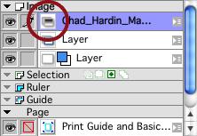
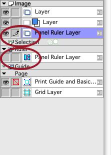
The editable layer is under Rulers, whilst the finished panels are in the artwork layers (the upper of the two circled below). To avoid confusion, I tend to rename the upper layer to "Panel Borders"


If you can't see the finished panel borders, then you may have artwork layers above the panels, and will need to drag the Panel Borders layer to the very top of the stacking order.

At this point you should see that not only do you have lovely, ruled panel borders, but that the space between them is automatically masked. Note that this solid white between the panels can be erased, as can the borders themselves, so if you want to have a gun muzzle poking beyond the frame border, you can erase both the border itself and the masking white to reveal the bits of the drawing you require.


If you want irregular panel shapes then you can switch to the Polyline Tool (draws irregular polygons -- double click to close the shape) or the Circle Tool, or pretty much any other drawing tool whilst you're working on the Panel Ruler Layer.


Select the option shown below before you start, and the tool will create a ruler to the shape you've drawn on the current layer. Since you are on the Panel Ruler Layer, this will create a new panel which will rasterize like any other.

As always, comments, questions and feedback are most welcome.

Wednesday, 20 October 2010

Wednesday Surgery


Man(ga) Bites Dog

Krom, from theincidentreport enquires about lettering using the tools in Manga Studio Debut.


I apologize unreservedly, but I can't help with this. I have looked at the lettering tools in Manga Studio, both Debut and EX, and -- whilst I am a huge fan of the package -- the lettering tools are not fit for purpose at this time. Simple tasks like font selection are horrifically clunky, and the fine typographic controls over horizontal scale, tracking and the like, are either completely absent or so well hidden as to make them functionally useless.

However, Manga Studio's functionality is coming on leaps and bounds from version to version, and I plan to keep my copy up to date, so I promise to re-visit the lettering features every time I upgrade.


Warning: Contains Graphic Formats

Another common question that seems to be the source of some confusion relates to file formats, image compression and resolution, which I thought was worth a quick Wednesday post.


(Part Three of the Illustrator Guide will be along tomorrow or Friday, for those that are interested.)


Of necessity, this post vastly oversimplifies a hugely complex area, but even in these broad strokes it should give you some idea of how these things work, although if you are happy with the difference between TIFFs and JPEGs and know your DPI from your PPI, you can probably stop reading now.


To begin with, graphic file formats can be divided into two types: vector and bitmap.


Everyone will be familiar with vector data, since it is used in fonts. The shape of each character in the font is described mathematically to your computer and this is why a capital A can be scaled from 12pt to 72pt to 144pt without ever pixillating and becoming jagged.


Note, however, that if you have applied text to, say, a JPEG photo, it will become pixillated just like the rest of the image if you scale it up and print it out, or zoom into it on-screen. This is because JPEGs only support bitmap data, and you have converted the mathematical information in the original font into a collection of dots, pixels, just like the rest of the photo.


A bitmap graphic format is, to risk stating the obvious, precisely that: a map of the bits of data that make up an image. Imagine you have a set of coloured pens, 256 of them to be precise, each of them with a number on.


Imagine now that I read you a string of numbers. For the first number you take the corresponding pen and fill in one square on a sheet of fine-lined graph paper, and then move on to the adjacent square.


You can see that, eventually, you'd get a picture. However, you can also see that even with 1mm square graph paper, the grid is too coarse and the selection of colours too few to create, say, a convincing photograph. However, when you get right down to it, this is how all bitmap formats work. Note that this type of graphic format is sometimes referred to as raster graphics (there is a subtle difference between the two terms, but not enough to worry about here).


If you imagine that the graph paper is divided into 1-inch squares, and each of those squares is divided 300 times along the x and 300 times along the Y axis, then that image would be 300dpi. One square inch would contain 90,000 individual squares for you to fill in. 


Bear in mind that you're going to need more than 256 colours for a photographic image, and you start to see that detailed colour images are going to contain a lot of data. 


The key difference between bitmap graphic formats is how they choose to compress that data and reduce file size.


There are a lot of legacy formats floating about for all sorts of historical reasons but, leaving aside the native file formats of graphics applications like Photoshop's PSD or Painter's RIFF, formats like .bmp or .tga (or, frankly, .gif) are useless relics.


The JPEG file format has become largely ubiquitous, but it has no place in any print-based workflow, other than (arguably) for use as a low-res positional image. Let me say that again:


JPEGs have no place in ANY print-based workflow.


This is because JPEG is a "lossy" compression format. Designed in the early days of the internet when we were all stuck watching pages load one image at a time over a 14.4k modem, the JPEG uses a very clever algorithm to sacrifice detail in order to reduce file size. 


JPEG stands for Joint Photographers' Enterprise Group, who did some very clever research into the way that the human eye and the human brain can infer detail in a photo when it isn't actually there. Using this research, they were able to develop an algorithm that allows a portion of the information in the photo to be "thrown away" when the image is saved, and "reconstructed" when the file is displayed.


Imagine a photo that is a perfect square. The bottom horizontal half of the photo is all grass and children's toys and the horizon runs exactly across the middle of the photo. The top half of the photo is all one tone of blue sky, but the upper right quarter has a tree stump in it.


At its most simplistic, instead of going: Pixel 1, blue; Pixel 2, blue, Pixel 3, blue…the JPEG format divides that image into four squares. It looks at the first, top left quarter, which is all blue sky. This whole square can be described with one colour. Depending on the quality settings, it may well disregard some subtle variations in tone. 


Square Two is the same as square one, but has the tree stump. The algorithm will divide this square into four again. Three of these four squares are now sky and can be described with one colour, but the fourth still has the tree stump in it, so gets divided by four again, and so on.


The bottom half of the photo will require many more subdivisions because of all the detail contained in the grass, and the variation in colour provided by the toys.


Nonetheless, what the JPEG algorithm is trying to do is settle on a compromise between detail and file size that is "good enough", the level of "good enough" being defined by your choice of quality settings.


Imagine the same photo, but now you're saving as a TIFF with LZW compression. In this instance, the file achieves compression by this method:


Instead of going: Pixel 1, blue; Pixel 2, blue, Pixel 3, blue… It goes Pixel 1, blue; REPEAT x312 (or however many blue pixels there are in a row before there's a change of colour).


You can see that savings in file-size using a TIFF also favour limited colour palettes and/or areas of low detail, but TIFF achieves that saving without sacrificing any detail, which is why LZW is described as "Lossless" compression.


Even if the intended destination of your image is use on the web, the JPEG compression is sacrificing quality in your image. Keep your file in its native format (.psd for Photoshop, .ai for Illustrator) and "Save for Web & Devices" at the very end of the process.


There's much more to cover on this subject, but that will have to be a post for another day.


As always, if there are any questions arising from this post, or, indeed, on any other post to date, or if you just can't figure out how to do something in Illustrator, Photoshop, or Manga Studio, post the question in the comments here and I'll do my best to answer it in Sunday's surgery.