Tuesday, 6 March 2012

Design Basics: Logo Advice

Just a quick post in response to having seen many logos posted to design forums for critique recently that seem to have been unaware of this fundamental piece of advice:


Design your logos in black and white

Seriously. If you design your logo to one colour scheme, you may find it doesn't work in other colour schemes… what if your original colours clash horribly with some future piece of artwork onto which it has to be overlaid? You're restricting the flexibility of the logo enormously by designing it with a colour scheme in mind. Use black and white for all your strokes and fills plus one solid grey tint if absolutely necessary. If your logo doesn't work within those limitations, your logo doesn't work, period.


No effects. No bevels, no embosses, no gradient fills. If your logo needs these things to make it look interesting, then it's a boring logo. No amount of icing and sprinkles will disguise the fact that your cake isn't properly cooked; pretty much the same principle with logos.


Make a nice, strong logo that works in solid black and white. If your logo doesn't do the job in monochrome, scrap it and do a new one. Once you have a logo strong enough to catch the eye in black and white, you can spiff it up to your heart's content. But here's the thing: you won't need to.

Tuesday, 28 February 2012

Happy Birthday, 2000AD!

This month, Britain's beloved SF weekly anthology celebrated its thirty-fifth anniversary, the last, defiant survivor of a market that doesn't even exist any more. I've already sung the praises of the Galaxy's Greatest Comic as part of Down The Tubes' extensive tribute to the title, but I wanted to say a little more on the subject…


It's impossible to overstate the importance of 2000AD in the history of the comics industry, and its place in the hearts of its fans. 


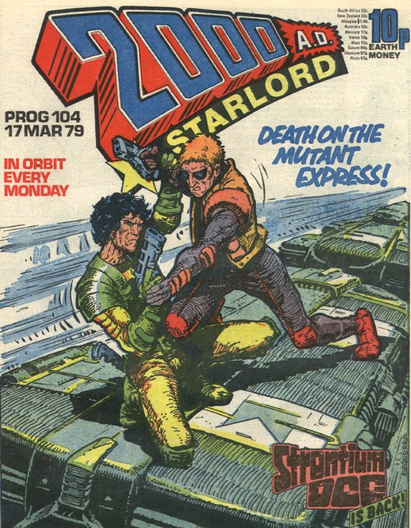
Prog 104: Thrill Power Encapsulated!
I'm a letterer because of 2000AD. Back when I got my first regular issue (Prog 104, fact fans) despite the phenomenal ink stylings of Carlos Ezquerra, the vibrant, dynamic cartooning of Ian Gibson, I was immediately drawn to the clean lines and heavy blacks of Dave Gibbons' rendition of Dan Dare. My Dad had grown up with Eagle and so I was pre-emptively disposed to like the character, I suppose…


Collector Ceri Levy owns this page, the splash page from that very issue. But click the image to enlarge, and take a look at the credits… Dave did his own lettering and got his name on the credits twice! To my ten-year-old brain, this was literally the coolest thing ever. From that moment on, I was unable to read a strip without noticing the lettering, without wondering how this effect or that technique was achieved, without mentally assessing which letterers' work I liked, which I didn't, and trying to work out why.


Of course, as artist, Dave had the advantage of being able to work his sound effect work into the art. In US comics, lettering was done by hand onto the pencils, so the inker was able to work around the SFX and integrate them into the art, but 2000AD letterers got finished, inked art (one artist usually produced the complete B&W page) and physically stuck lettering onto the art board, which made SFX work slightly more problematic.


Whenever I approach my sound effect work, I have Dave's lettering in mind, and the exemplary sound effect work of Alan Davis and Arthur Ranson.
Killraven: Art by Alan Davis
Button Man: Art by Arthur Ranson
Doctor Who: Art by Dave Gibbons
I'd also draw your attention to the clean, careful penmanship of letterer Steve Potter on the Button Man page above. Whilst the late Tom Frame is quite rightly acclaimed as the heavyweight of British hand lettering, Steve's contribution sometimes gets overlooked…
Nemesis The Warlock:
Art by Kevin O'Neill
Sadly, I don't have the issues to hand, and can't find a scan online of some of Steve's more inventive lettering work on Nemesis -- for the giant, intelligent spiders in Book II, for example, their dialogue balloons are anchored to the edges of the panels by streamers of webbing!


The simple fact that hand-lettering was so time-consuming meant that 2000AD maintained a large roster of letterers, all with instantly recognisable styles: Jack Potter (any relation to Steve? I have no idea!), Pete Knight, Bill Nuthall, John Aldrich, Tony Jacob… later joined by Rich Starkings, Annie Parkhouse, Ellie De Ville, the latter two have taken 2000AD through into the era of digital lettering and have been joined by the admirable talent of Simon Bowland.


So… 2000AD letterers all, I salute you. And a special word of thanks to the Godfather of 2000AD himself, Mr Pat Mills, whose decision at the title's creation to eschew the standard letterpress machine lettering of the time in favour of hand lettering throughout went so very far in ensuring that the comic felt like nothing else on the stands at the time.


I could go on … and probably will, but that will have to be a post for another time.

Sunday, 19 February 2012

Interleaved Balloons

One of the key skills of being a letterer is the ability to cram unfeasibly large amounts of copy into spaces that clearly were never intended to accommodate them!


There are many ways to maximise the efficient use of lettering space but one I haven't covered before is to interleave connected speech balloons:


A merged shape, as you would normally use to create a linked balloon like this, can only be at one level in the stacking order, so you have to do a little cheating to get one balloon behind the "Thanks, Joe" balloon and one in front.


I'm not aware of any hard and fast rules for the stacking order. I think of the balloons being laid down in the order that they're spoken, with the 'oldest' being laid down first and the each subsequent balloon going on top, becoming 'nearer' to the reader as they get 'nearer' chronologically. There's no good reason why you couldn't do it the opposite way round, but I would strongly advise consistency: pick one way or the other and stick to it.


So, in this example, the dialogue goes 1, 2, 3:


These are just normal speech balloons, exactly as you would usually create them. Use the Arrange -> Send Forward and Send Backward options to get them in the correct stacking order.

Next, draw a connector:


(As an aside, some letterers draw their connectors wide-to-narrow in the direction of the reader's eye; I prefer narrow-to-wide, since the connector and the balloon are coming 'towards' the reader.)

Select the connector with Selection tool (black arrow), and hit CMD-C to copy. Then use the (ungrammatically named) Paste In Back function:


This will place a copy directly behind the one you've just drawn. However, it won't be far enough back in the stacking order for your purposes, so then use Arrange -> Send to Back to place the copied connector at the very back of the stacking order.


(Note: you could create separate layers for the elements that make up the connecter, but I don't think it's really necessary.)

At this point, the back version of the connector will be selected, but if you accidentally deselect it, or need to select it again for some reason, simply draw a marquee with the Selection tool over both connectors:

And then SHIFT-click on the top one, which will deselect it, leaving only the bottom one selected.

The next thing to do is increase the stroke value of the back connector. Whatever your current stroke value is, double it:

This is because half of the thickness of stroke will be hidden when you do the next step.

Select the top connector and set the stroke to 'None':


So now you have a white connector with no stroke on top, masking the edges of the balloon and giving the appearance of a merged shape but enabling you to have the balloons in different positions in the stacking order.


Simples!

Thursday, 2 February 2012

Please, sir, can I have some Mo(o)re?

(This blog post shamelessly repurposed from some musings yesterday on Facebook.)


Honestly, I don't see the fuss over DC's Watchmen prequels.


Alan Moore signed a work-for-hire contract, so DC are free to do with the property as they see fit. Now, I think it is fair comment to note a certain amount of barrel-scraping creatively (given that DC has already managed to spin a major crossover event out of a six-page Green Lantern story Moore wrote nearly 30 years ago).


I say the following as someone who has boundless admiration for his work and deep personal affection for the man himself, having met him a couple of times (albeit many years ago), but… 


I find Moore's stance on copyright perplexing and bordering on the hypocritical. Just once, instead of slagging off, say, 2000AD, I'd like him to say that he appreciates the fact that Steve MacManus gave him a platform from which he went on to become arguably the most successful comic writer in the world, instead of winding up in prison due to being "the world's most inept drug dealer."


(I should point out that this last is actually Alan's own description of a part of his pre-comic-writing life.)


It's true that he and Dave Gibbons would have got the rights to Watchmen back if DC had let it go out of print, but does anyone seriously think that DC would have kept on printing the book if it wasn't selling? I suspect that once every six months a royalty cheque drops through Alan's letterbox that would make the rest of us very happy indeed…


(I also can't help but wonder what Moore's position on the rights to Watchmen would be if Dick Giordano had OKed it when it still used the Charlton characters that were in the original proposal…)


I can see how some of the ABC stuff and the like might make Alan very, very suspicious of the motives of mainstream comic publishers, I can see how the LXG movie lawsuit has left him very wary of the entertainment industry in general, but I don't believe anyone ever forced him to sign a contract at gunpoint, or that any of those contracts were materially worse than anyone else in the industry was getting at the time.


At the same time, though, I don't quite understand how Moore squares his own position on creators' rights with his seeming belief that he can plunder the literary back-catalogue with impunity; or that contracts he signed somehow shouldn't now apply to the work he created under them.


Frankly, it baffles me and I wish Alan would just shut the hell up about it, since this one frustrating, illogical position he insists on banging on about is starting to colour my opinion of a man whose writing genuinely changed my life.


However, I have to undermine my own rant with the following caveat:


Alan Moore doesn't go to conventions; doesn't have an internet connection; doesn't even have an e-mail address. I genuinely believe that Alan has not the least idea (and probably cares even less) how famous he actually still is in the comics industry.


I don't believe for one second that he spends his days in some fever of seething resentment at the iniquities heaped upon him by the comic industry. Rather, I suspect he potters about Northampton opposing the closure of local libraries and gently removing small rodents that have taken to nesting in his beard and gives not the most passing of thought to the state of the comic industry…


Until, of course, Rich Johnston (or whoever) phones him up and presses the "guaranteed to elicit a number of pithy quotes from Alan Moore" button, after which they sit back to enjoy the sounds of gnashing teeth from the serried ranks of comic geekdom and to watch the hit counter on their website spin round so fast it becomes a blur.


It bears repeating that Alan Moore does not have an internet connection. For Alan's opinion to make it onto the internet, someone has to have actively sought it from him. Now, it's perfectly fair and natural for comics news sites to seek his opinion, but it's also important to remember that the man himself is not publishing vitriolic screeds on his blog or issuing the comic book equivalent of fatwahs via Twitter.


In fact, I suspect if Alan really knew how famous he still was in the comics industry that he would bellow at us (in that splendid accent of his): "IT WAS TWENTY-FOIVE YEARS AGOW! MOVE ON!"

Sunday, 29 January 2012

Shameless ballot-stuffing!

This year's Eagle Award nominations close very soon. I may make the shortlist if you vote for me as 'Favourite Letterer" -- follow the link below, if you feel so inclined. All nominations gratefully received!


Click here…

Thursday, 26 January 2012

Strip Magazine: Restoring Hook Jaw!

For this post, I thought I'd take a quick look at one of the more involved lettering jobs I've been working on, the 'restoration' of classic 70s British comic strip Hook Jaw for the new Strip Magazine.

I remember Hook Jaw and the comic it appeared in -- Action -- from my childhood. As was the norm at the time, it was lettered using typeset Letterpress lettering, giving the lettering a very uniform and (frankly) boring appearance. When 2000AD appeared a couple of years later, editor Pat Mills had the whole thing produced with hand lettering, because he felt it looked more dynamic and exciting, and I had to agree. This practice then spread to other titles in the IPC stable and (although Action was long-gone by then) comics like Battle moved to hand lettering as well.

When Strip editor John Freeman announced that the new comic would be reprinting Hookjaw, I leapt at the chance to re-letter the strip. Much of the original artwork is long lost or possibly in the hands of private collectors, meaning that the only artwork available to use is scanned from the printed pages complete with the Letterpress lettering in place.

I felt that simply trying to drop new lettering over the old to cover up the previous balloons would be a less than ideal solution -- the new balloons might not be the same size, and some of the positioning (with the benefit of hindsight, obviously!) might not be ideal. John didn't take much convincing, and it was agreed that I would remove the old lettering digitally, and redraw the missing parts of the page so that we could approach the pages as if they were brand new pieces of artwork…

So, here's a quick breakdown of the process:

1) The pages are supplied to me electronically, courtesy of comic archivist Moose Harris (whose excellent sevenpennynightmare site can be found here)…

Click for larger version. 


Moose has already done an excellent job of cleaning up the artwork during the scanning process and dropped out the original colouring.

2) I import the artwork into Manga Studio EX. Many comic artists work in Photoshop, but Manga Studio has (for my money) far better tools for simulating traditional inking techniques, making it perfect for this sort of work. If you look on the right hand side of the screen shot, you'll see that I've added two layers, "White" and "Black"…

Click for larger version

3) Using one of the pen tools, I white out all the existing lettering. I try to remove as little of the surrounding artwork as possible -- I'm supposed to be restoring the original page, not showing off my own (limited!) drawing skills.

Click for larger version
3) Occasionally using a bit of guess work to figure out what had originally been under the lettering, I move on to the black layer and, using a combination of Manga Studio's pen and brush tools, do my best to recreate the missing linework.

Click for larger version
4) I then upload the artwork by FTP to the editorial server. The artwork then goes to the colourist (in this case, the very talented Gary Caldwell) and John Freeman reviews the script to provide me with a final lettering version.

5) The Gary provides the coloured version of the artwork…

Click for larger version

6) Which I then place onto a lettering template in Adobe Illustrator, and letter in accordance with script…

Click for larger version

…which then goes back to John for proofing, corrections and final approval. After that, it's ready to go in the comic!

Did I mention that this job is a whole lot of fun? I probably should -- a "Hook Jaw Day" might just be my favourite part of the month!

Cheers

Jim


Wednesday, 18 January 2012

SOPA: off-topic, but too important to let pass…

The SOPA Bill fundamentally misunderstands how the internet works, panders to the interests of big business, is built on a systematic campaign of distortions, half-truths and outright lies spread by the entertainment industry and their lobbyists, and is just plain bad law.


And Rupert Murdoch supports it.


Although a piece of US legislation, it seeks to affect the whole world via the internet and thus is of legitimate concern to anyone with an internet connection. Thus far, the level of argument put forward in defence of SOPA is broadly equivalent to saying that if you oppose the death penalty, you must be pro-crime. This is patently nonsense, as is SOPA itself.


I can only urge American readers of this blog to lobby their elected representatives in the strongest possible terms. Again: this is bad law.


Apologies for the off-topic digression. Normal service resumes shortly.