About a million years ago, artist PJ Holden (who's actually a very handy letterer himself) tweeted on the subject of lettering:
"Ok-you have six fonts you have to live with forever: what are they?"
And then rather presciently added… "(This is a good starting point for a blog post...)"
I dutifully started typing up a blog post on the subject and then, unsurprisingly, forgot all about it. When I decided to revive this blog, however, I remembered that half-written post and tracked it down.
So. If I was only allowed six fonts to try and make my way as a letterer…?
You can probably get away with just one all-purpose dialogue font to do the heavy lifting… one that's 'neutral' in tone (something 'bouncy' feels specific to stories that are lighter in tone, something heavier or spikier is likely more suitable for darker or more serious projects, so you'd need to steer a course between the two).
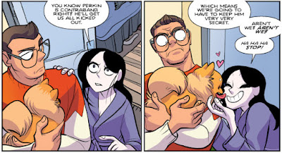
I'd almost certainly plump for Blambot's Heavy Mettle BB, mainly because you get an all upper and a mixed-case version, plus an Extra Bold weight. I've used it on a wide variety of projects (from Giant Days for BOOM to SIX for 451) and it's never looked out of place. The letterforms themselves also put me in mind of John Workman's always-amazing lettering, which is never a bad thing.
 |
| Giant Days #47: Words by John Allison, art by Max Sarin, colours by Whitney Colgar |
 |
| SIX #1: Words by Andi Ewington, art by Mack Chater, colours by Dee Cunniffe |
 |
| Weavers #1: Words by Si Spurrier, art by Dylan Burnett, colours by Triona Farrell |
You'll need at least one ‘handwriting’ font for the inevitable diary/ journal/ letters. Handwriting fonts are the bane of my life — I must have spent hundreds of pounds on dozens of fonts and the inescapable truth is that fonts that actually look like handwriting are never legible for large blocks of text, and ones that are legible never look much like handwriting. Given the choice between these two options, I always opt for legibility and assume that the reader will be able to infer that the text is meant to be 'hand-written' from context.
My default choice is almost always Comicraft's CCDearDiary. (Honourable mention for Blambot's Chewed Pen BB, which has the benefit of being free for amateur/small press/indie letterers.)
You need one ‘clean’ sound effect font to do the bulk of the SFX lettering. I'm not a fan of using dozens of different fonts for SFX on any given project, so this would be no major hardship for me.
I'd probably settle for Blambot's Fight To The Finish BB. It's not my absolute favourite, but comes with multiple weights/styles and is neither too jaunty for 'serious' books nor too weighty for lighter ones.
Add in one rough/brush SFX font for variety. I'd go with Blambot's Beelzebrush BB — it comes in regular and black weights, with alternate font versions for both weights, so you can get six non-repeating ‘O’s in that BOOOOOOM by using the uppercase ‘O’, the lowercase ‘o’ and then zero, and then repeating with the alternate version of the font.
Two left…? A couple of general purpose design/titling/signage fonts, maybe? Comicraft's CCHipflask and CCEnemyLines.
The obvious omission here is any kind of special/creature dialogue fonts. I'm not averse to using those, but (like a lot of letterers lately) I'm trying to push back on their over-use. In all honesty, you can probably distinguish that robot/vampire/whatever dialogue with some creative balloon and colour choices, so I haven't chosen any.
And just to tidy that all up:
Heavy Mettle BB:
CCDearDiary:
Beelzebrush BB:
CCHipflask:
CCEnemyLines:


