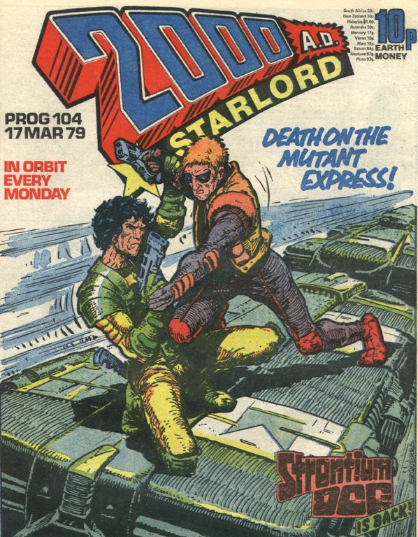
It's impossible to overstate the importance of 2000AD in the history of the comics industry, and its place in the hearts of its fans.
 |
| Prog 104: Thrill Power Encapsulated! |
Collector Ceri Levy owns this page, the splash page from that very issue. But click the image to enlarge, and take a look at the credits… Dave did his own lettering and got his name on the credits twice! To my ten-year-old brain, this was literally the coolest thing ever. From that moment on, I was unable to read a strip without noticing the lettering, without wondering how this effect or that technique was achieved, without mentally assessing which letterers' work I liked, which I didn't, and trying to work out why.
Of course, as artist, Dave had the advantage of being able to work his sound effect work into the art. In US comics, lettering was done by hand onto the pencils, so the inker was able to work around the SFX and integrate them into the art, but 2000AD letterers got finished, inked art (one artist usually produced the complete B&W page) and physically stuck lettering onto the art board, which made SFX work slightly more problematic.
Whenever I approach my sound effect work, I have Dave's lettering in mind, and the exemplary sound effect work of Alan Davis and Arthur Ranson.
 |
| Killraven: Art by Alan Davis |
 |
| Button Man: Art by Arthur Ranson |
 |
| Doctor Who: Art by Dave Gibbons |
 |
| Nemesis The Warlock: Art by Kevin O'Neill |
The simple fact that hand-lettering was so time-consuming meant that 2000AD maintained a large roster of letterers, all with instantly recognisable styles: Jack Potter (any relation to Steve? I have no idea!), Pete Knight, Bill Nuthall, John Aldrich, Tony Jacob… later joined by Rich Starkings, Annie Parkhouse, Ellie De Ville, the latter two have taken 2000AD through into the era of digital lettering and have been joined by the admirable talent of Simon Bowland.
So… 2000AD letterers all, I salute you. And a special word of thanks to the Godfather of 2000AD himself, Mr Pat Mills, whose decision at the title's creation to eschew the standard letterpress machine lettering of the time in favour of hand lettering throughout went so very far in ensuring that the comic felt like nothing else on the stands at the time.
I could go on … and probably will, but that will have to be a post for another time.


